

Worldweaving in 2026
a way out of the uncanny valley of current brand worlds

I haven’t felt like listening to any work related podcasts in the last six months, but this week, the veil lifted.
Kira Mackenzie is someone I respect and whose takes I find thought provoking, so I figured I’d listen to her newest interview on FFW. Jasmine does a great job asking what we wanna hear, so I was glad when she asked Kira about AI, and how her and her teams use it.
Her answer was that AI can be used for a lot but that (and I’m paraphrasing here) where she thinks AI doesn’t work is in consumer facing creative.
She goes on to say that AI can be good at driving visual direction so that a human can then execute on that. This I vehemently do not agree on since it’s akin to claiming it can ideate successfully, which, no. But I do think it can be a good tool to set up organizational frameworks.
Back to her initial point though, 100%. I feel like we have been living in uncanny brand valley this year (and last, and the one before).
I’ve had the sense, even before the excessive proliferation of LLMs, that tactile, human made is the only way humans connect to their visual environments. I’m not a scientist but I bet those guys (and by guys I mean women) would find some cool brain imaging to support this theory if they felt like it.
This is how I approach typography. For whatever reason, whatever I make or adjust by hand generates a feeling of recognition within myself and others that just feels right, better, more compelling. I like it more, clients gravitate towards it, and consumers buy it. This is why we are all obsessed with archival graphics: there was a time before fonts even existed when everything was handlettered.
I once attended a lecture while in design school by an artist with a modicum of fame who was kind of a dick. He said, to a (zoom) room full of budding designers that the usage of fonts was always lazy; that any designer worth their salt would handletter any type they were creating. I rolled my eyes, and I think fonts have a place, but his words have haunted me since.
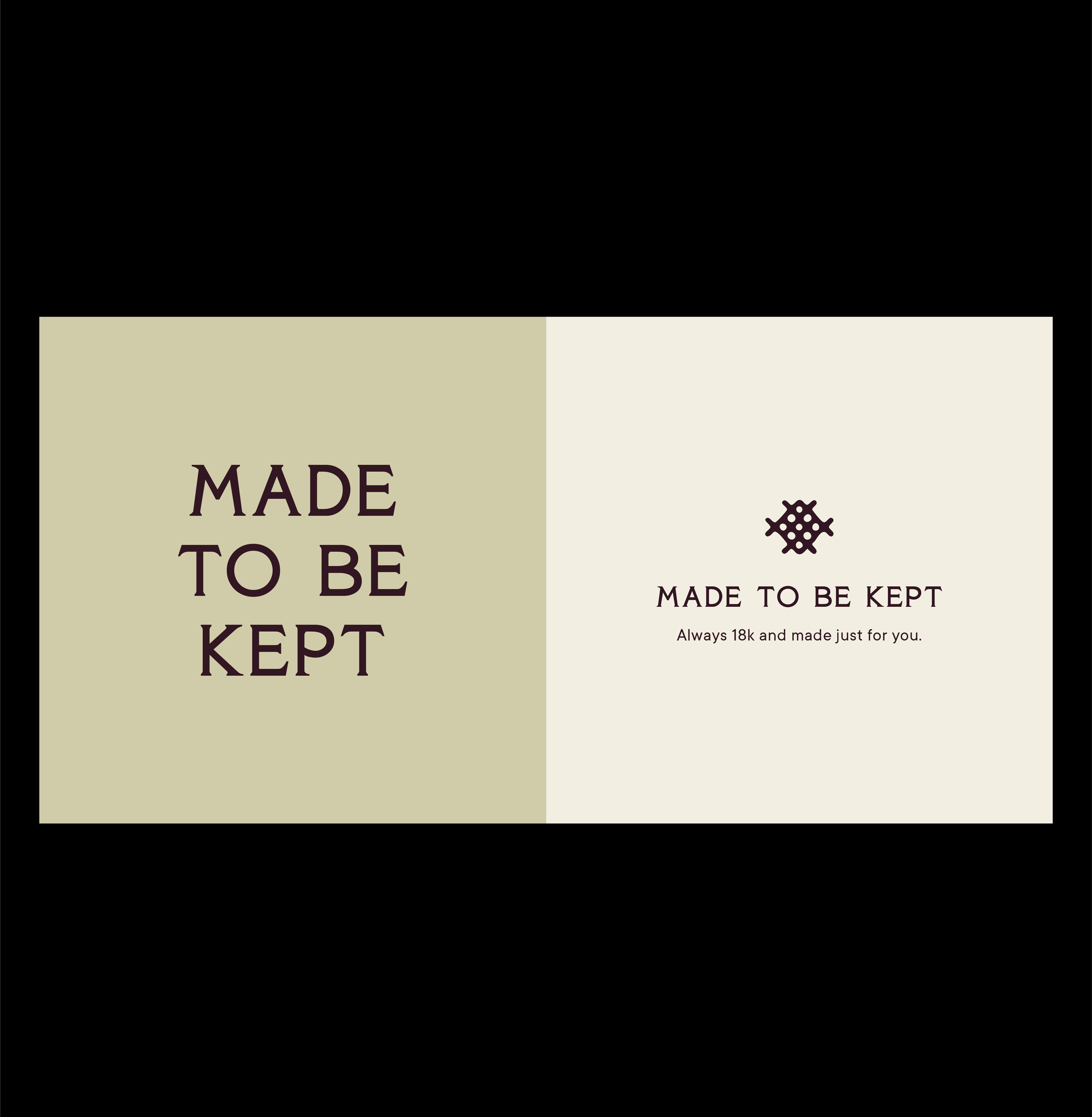
So, with that, here is a project that I have adored working on. The goal that I bring to any project but that felt particularly present while rethinking the visual world of illa is to find a place for the brand in a tactile world that is rooted in deep instinctual human recognition, and that feels true to the brand and its creator.
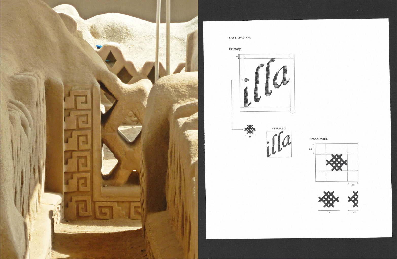
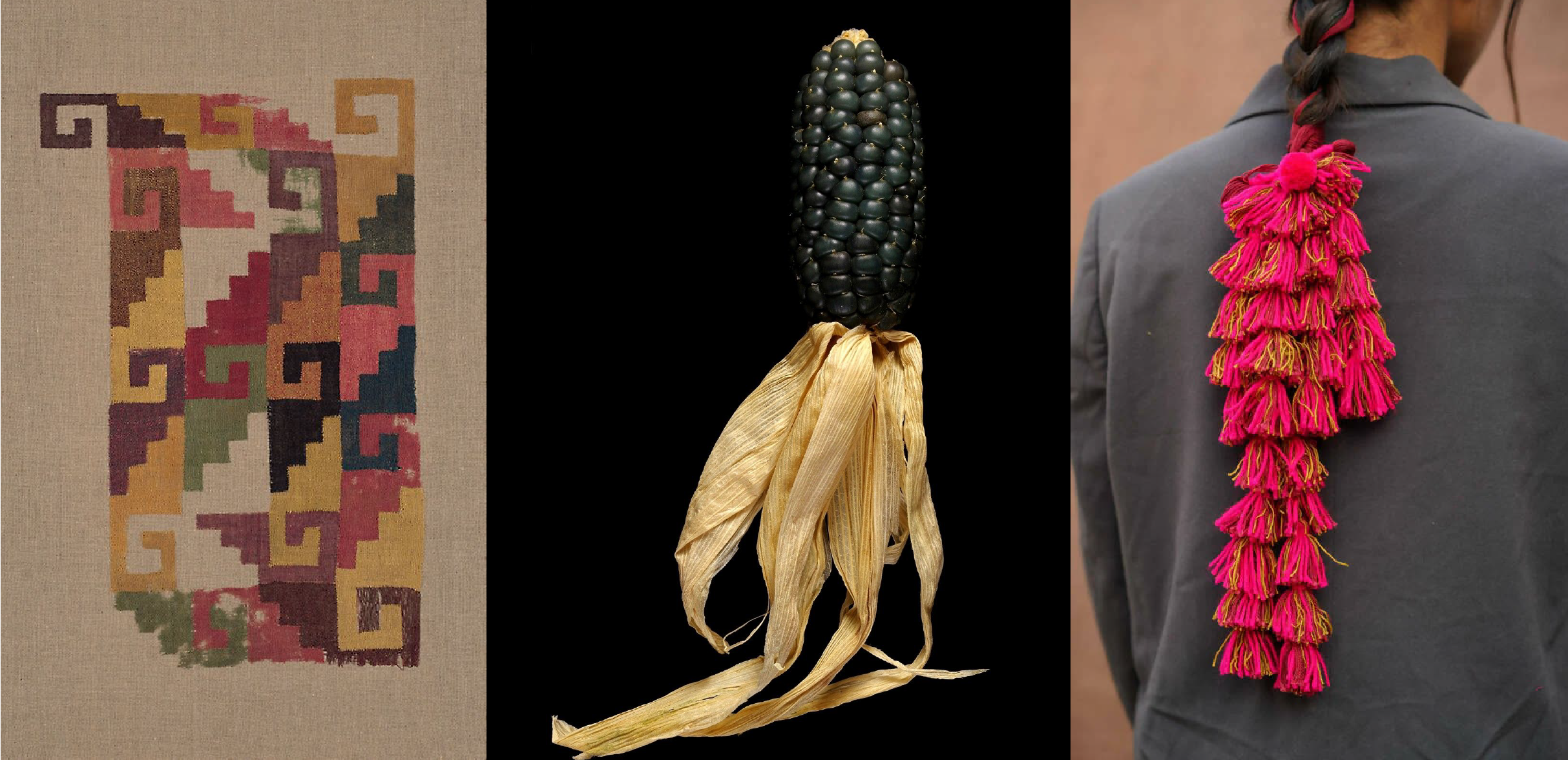
For the primary logo, I was inspired by Chan Chan, an archeological site near the Trujillo region. Andia’s family is from the North of the country as well, and the beauty of the ruins, geographical significance, and cross stitch feeling reminded us both of what it means to be from Peru.
xoxo,
Camila